
The COVID-19 pandemic sure looks like it’s long past it’s peak — and might be over, at least according to a new chart from the Centers for Disease Control and Prevention (CDC).
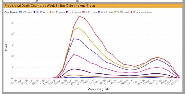
Take a look at the chart above, titled “Provisional Death Count For Coronavirus Disease (COVID-19).”
The peak appears to be around the weeks of April 18 and April 25, with a steady decline until the beginning of July. The virus spiked throughout the month, but then began to slide again in August. For all age groups except 75 years old and above, the weekly deaths dropped well before 1,000 by mid-month, and are all near zero now.
Take a look for yourself at the CDC site.
Read the full story from The Gateway Pundit
Want more BFT? Leave us a voicemail on our page or follow us on Twitter @BFT_Podcast and Facebook @BluntForceTruthPodcast. We want to hear from you! There’s no better place to get the #BluntForceTruth.


